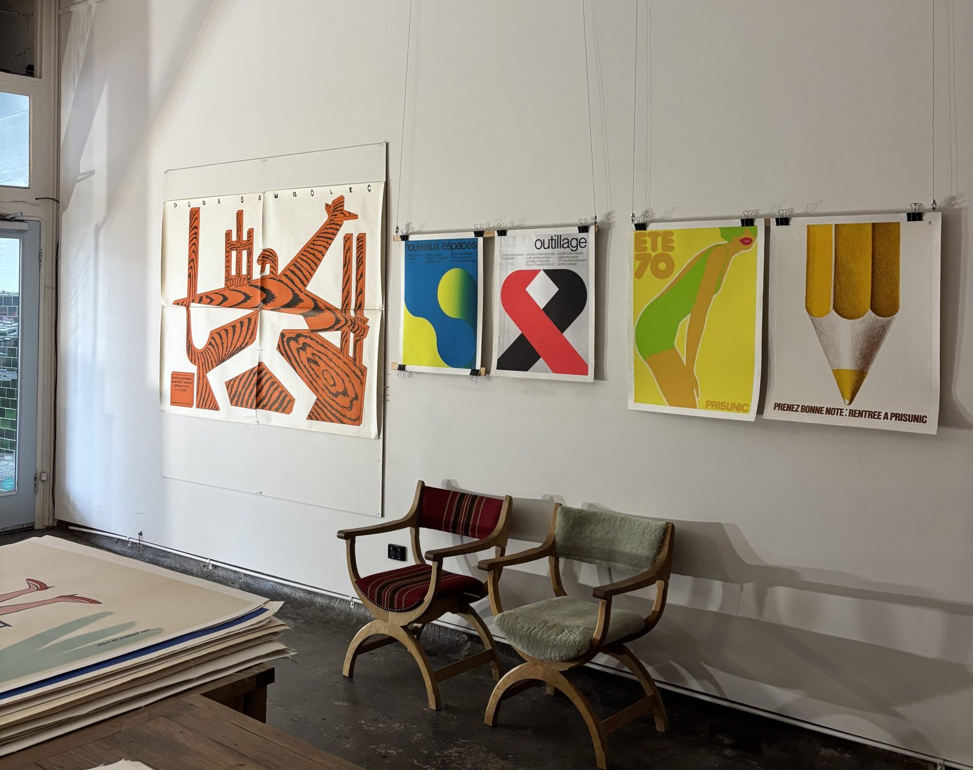
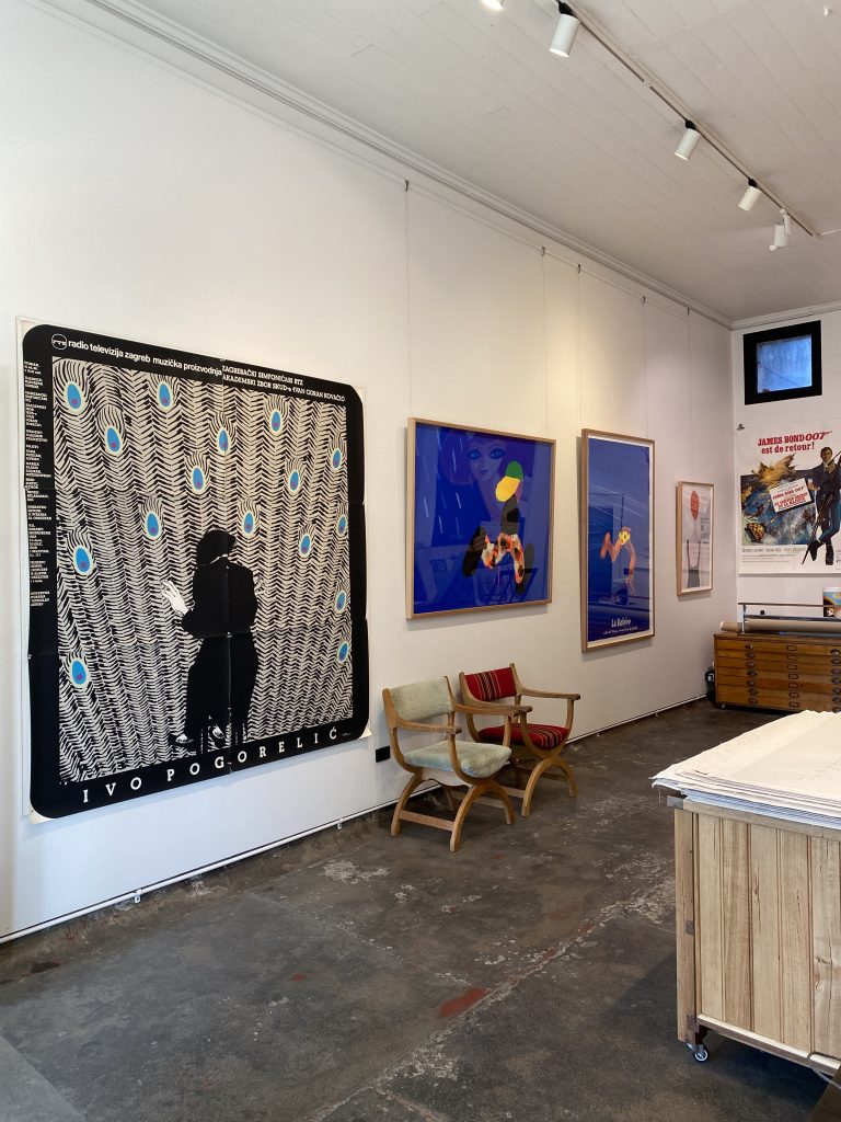
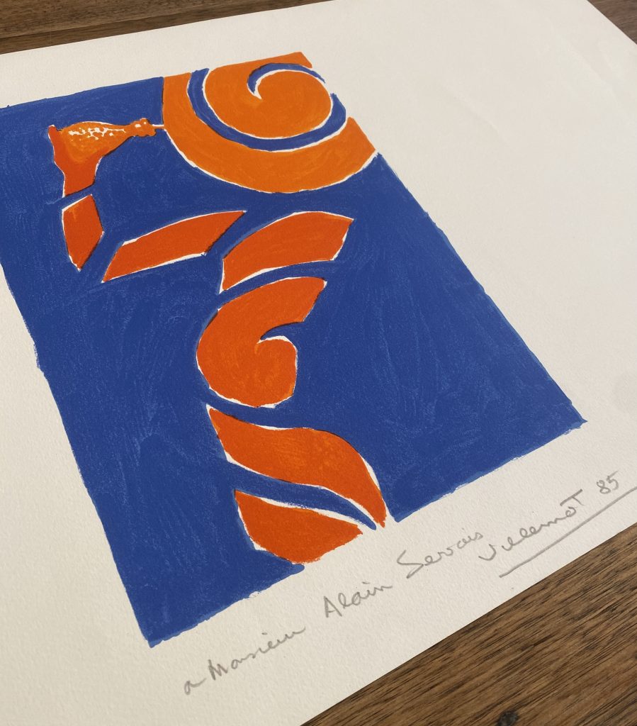
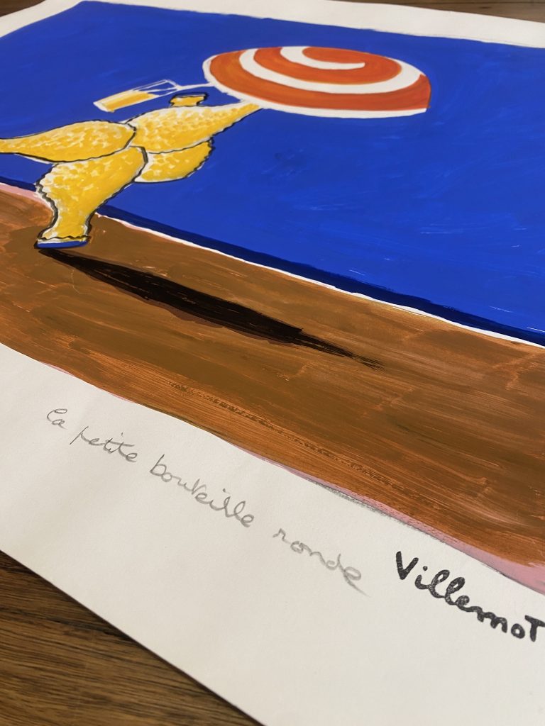
Celebrating Melbourne Design Week with Vintage Posters
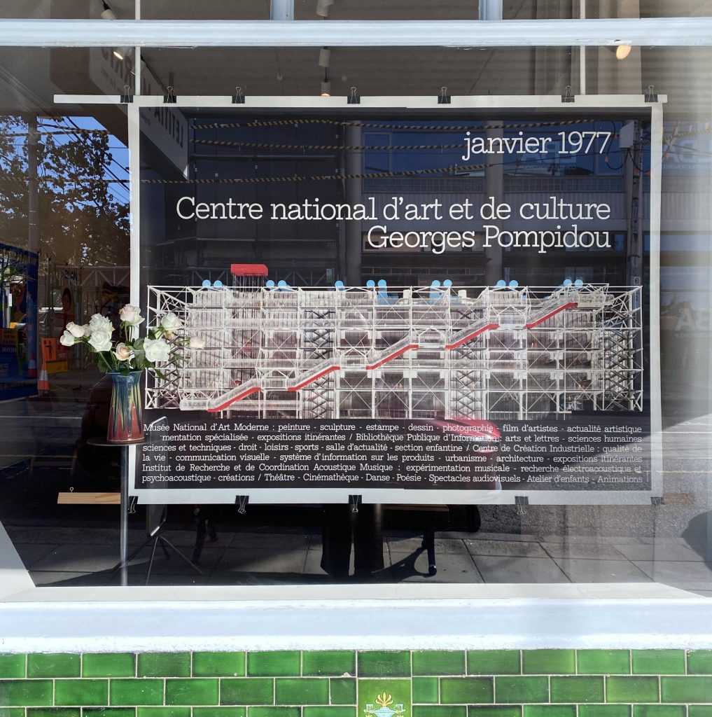
‘Georges Pompidou’ Jean Widmer
“Widmer claimed a practice of basic design, grounded in reduction, coherence, and legibility. Every form, every colour, every proportion carried meaning.”
– Centre Pompidou
To celebrate design week in Melbourne, Letitia Morris Gallery have shortlisted our favourite graphic design posters which capture minimalism, colour and typography of the 60s & 70’s
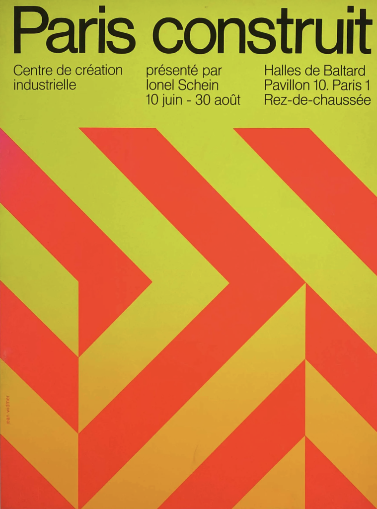
‘Paris Construit’ – Jean Widmer
For Jean Widmer, functionalism took precedence over decoration, characterised by reductive design and very simple forms. Born in 1929, Jean Widmer was a graphic designer based in Paris. Jean Widmer was a French graphic designer celebrated for bringing clarity, structure, and modernist principles to visual communication in France during the second half of the twentieth century. Influenced by Swiss typography and minimalist design, Widmer became known for his clean use of grids, bold symbols, and strong visual identities, particularly in cultural and public institutions. His work often balanced simplicity with poetic visual impact, helping to modernise French graphic design through projects such as museum identities, posters, and national signage systems.
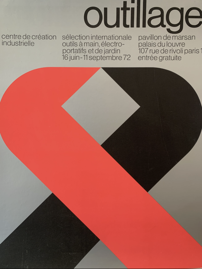
After World War II, designers in Switzerland and Germany pushed design into a cohesive movement called Swiss Design, or the International Typographic Style. These designers sought a neutral and objective approach; one that emphasised the subject by simplifying the images to a motif or simply a combination of colours. They constructed modular grids of horizontal and vertical lines and used them as a structure to emphasise elements in their designs. These designers preferred photography (another technical advance that drove the development of graphic design) as a source for imagery because of its machine-made precision. They created asymmetrical layouts, and they embraced the prewar designers’ preference for sans-serif typefaces. The elemental forms of the style possessed harmony and clarity.
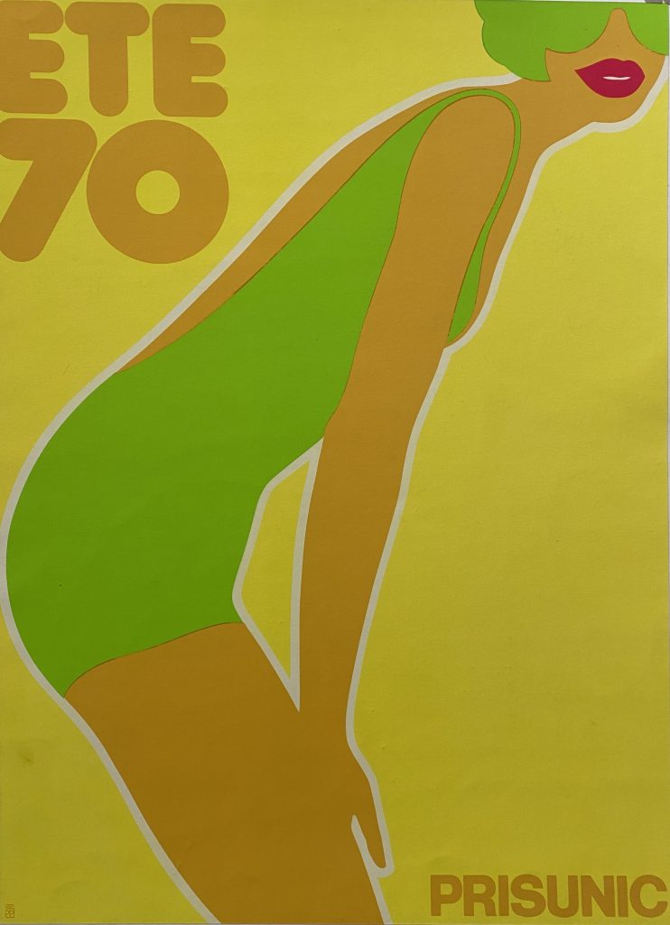
‘PRISUNIC ETE 70’ by Friedemann Hauss 1970
Friedemann Hauss was born in Germany and settled in Paris in 1967 after studying graphic art in Basel, Switzerland. Prisunic was a department store in Paris, and here we see “Summer 70”, a poster to advertise summer wear, 1970, which was exhibited in the street and in the subway. This poster received the prize for the most beautiful poster 1970.
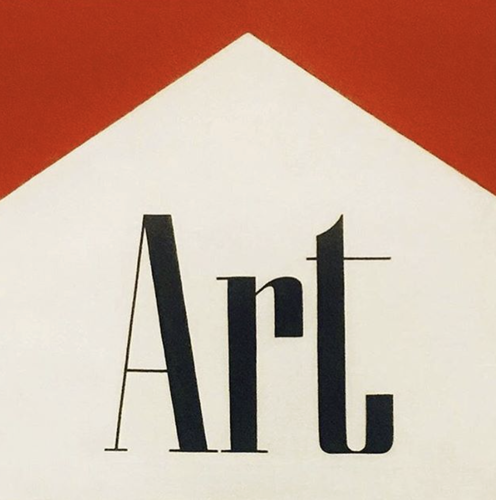
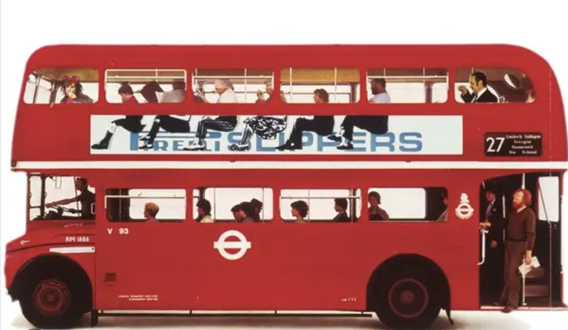
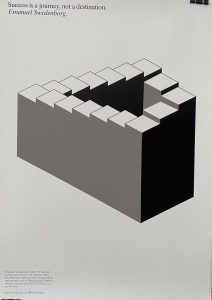
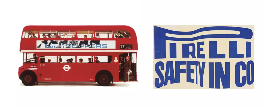 “I try to solve their problems, but in solving their problems take an opportunity to find that extra twist that adds the magic.” The art posters he did for IBM are a good example of this. IBM asked him to design a placard for their new Paris headquarters, which said a painting would shortly arrive for the space on the wall occupied by the placard. In response he produced a series of posters interpreting the word “art” as defined by an author or artist, and added the line, ‘Quest for Quality: an IBM exhibition’ along the bottom of each poster. The artwork image for each poster was thoughtfully interpreted by Fletcher and in turn reflected his keen eye and sense of humour. Keeping each poster in greyscale and black and white unified the series thematically, each poster telling a unique story. By incorporating quotes by well-known figures such as F Scott Fitzgerald and Confucius to J.F. Kennedy, the posters remain universal as well as personal.


 In 1947, Gruau began working closely with


