A Rare Find for Architecture Lovers
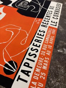
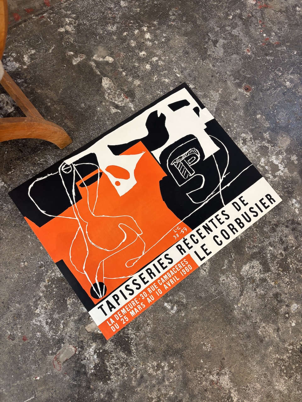
We’ve just brought home a genuinely unique piece from Paris — an original 1960 exhibition poster for Tapisseries récentes de Le Corbusier at Galerie La Demeure. It’s a true first edition, distinct from the later reprints that circulate more widely, and a rare find for anyone who collects architecture, design or modernism.
Le Corbusier needs little introduction as an architect, but far fewer people know him as a textile artist — which is exactly what makes this poster such an interesting piece of design history.

Who Was Le Corbusier
Born Charles-Édouard Jeanneret in Switzerland in 1887, Le Corbusier became one of the most influential architects of the twentieth century and a pioneer of modernism. He trained not as an architect in the traditional sense but as an engraver and designer, before travelling widely through Europe and the Mediterranean — journeys that shaped his lifelong obsession with proportion, light and pure geometric form.
He settled in Paris in the 1920s and, alongside his cousin Pierre Jeanneret, began developing the ideas that would define his career: that a house should be “a machine for living in,” stripped of ornament and built around function, light and structure. It’s a philosophy that reshaped how architects everywhere thought about space and concrete.
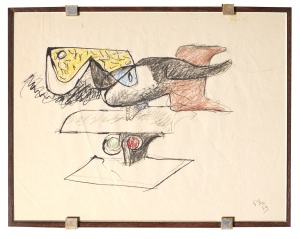
The Five Points of Architecture
In 1927, Le Corbusier articulated his “Five Points of Architecture” — pilotis (supporting columns lifting the building off the ground), a free façade, an open floor plan, ribbon windows, and a roof garden. These principles found their purest expression in Villa Savoye (Poissy, 1931), a house that looks almost weightless, floating above its lawn on slender white columns.
He carried these ideas into a very different scale with Unité d’Habitation (Marseille, 1952) — a vertical village of apartments, shops and a rooftop terrace that became the blueprint for post-war social housing across the world. Later, at Notre-Dame du Haut in Ronchamp (1955), he abandoned the machine-age austerity of his earlier work entirely, producing a sculptural chapel of curved concrete and coloured light that remains one of the most moving religious buildings of the modern era. In the final chapter of his career, he turned to urban planning at the scale of a whole city, designing Chandigarh, the master-planned capital of Punjab, India, including its monumental Palace of Assembly and High Court.
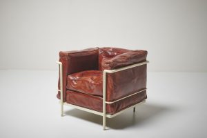
The Muralnomad Tapestries
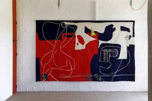
What’s less well known is that Le Corbusier spent nearly three decades working as a textile artist. He discovered tapestry in 1936, through the collector Marie Cuttoli, who was reviving the ancient Aubusson weaving tradition. By 1948 he had developed his own theory of it, which he called the “Muralnomad” — the idea that a tapestry could be a mobile, architectural element of the modern house, something that could be “detached from the wall, rolled up and taken under the arm” and carried to another room, or another home entirely.
Between 1936 and 1965 he produced around thirty tapestries, among them Les Mains (1951), Bonjour Calder (1958) and Traces de pas dans la nuit (1957), drawing on the same purist forms and figures found throughout his paintings. His tapestries went on to receive major public commissions, including large-scale works for UNESCO’s Paris headquarters. Galerie La Demeure — the gallery behind this very poster — was central to that story, championing his woven murals in Paris and giving them the same serious attention as his buildings.
Why the Original Is Worth Having
Reprints of this exhibition poster circulate fairly widely online, but this is the genuine first edition, printed for the 1960 exhibition itself. Where a later reprint is flat and mass-produced, an original carries the texture, the slight imperfections of period printing, and the historical weight of having actually hung in Paris to announce the show. For a collector of architecture or twentieth-century design, that difference matters — this is a piece of the same story as Villa Savoye and Ronchamp, not a copy of one.
Where to See It
Like all our posters, this one can be viewed in person at the gallery — 1158 High Street, Armadale, Melbourne — open six days a week. We’re always happy to talk through condition, framing and shipping in person or over the phone.
https://letitiamorris.com/product/le-corbusier-1960-la-demeure-tapisseries-recentes/]
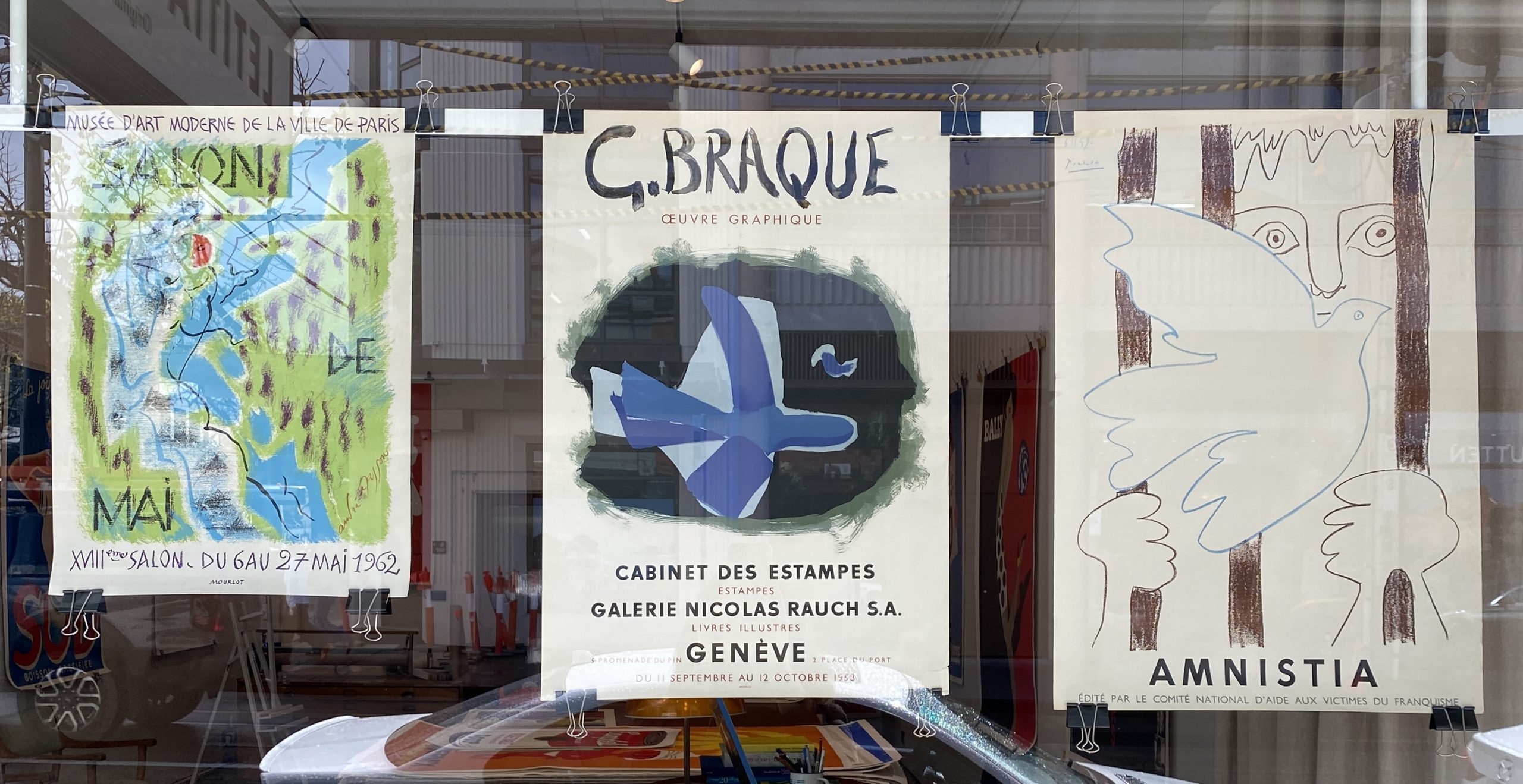
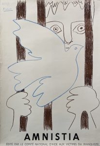
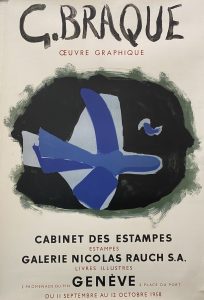
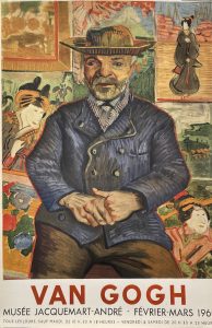
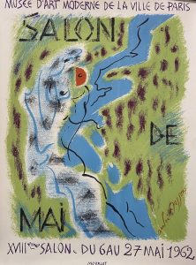

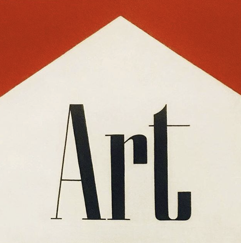
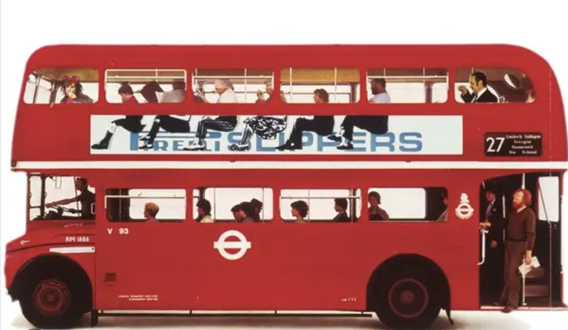
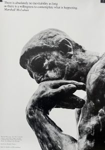
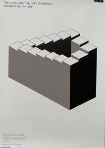
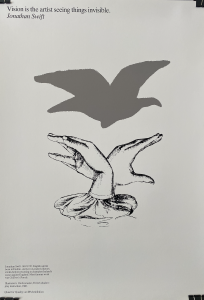
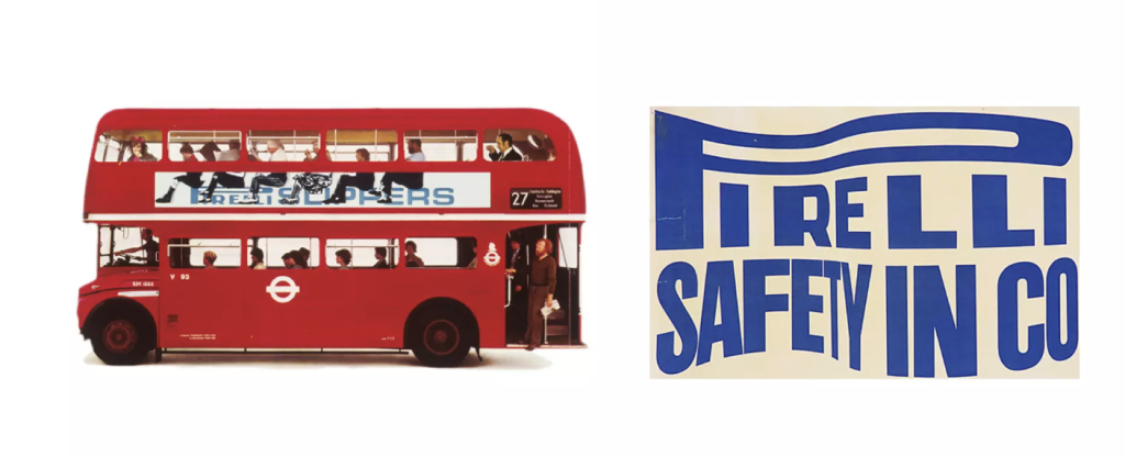 “I try to solve their problems, but in solving their problems take an opportunity to find that extra twist that adds the magic.” The art posters he did for IBM are a good example of this. IBM asked him to design a placard for their new Paris headquarters, which said a painting would shortly arrive for the space on the wall occupied by the placard. In response he produced a series of posters interpreting the word “art” as defined by an author or artist, and added the line, ‘Quest for Quality: an IBM exhibition’ along the bottom of each poster. The artwork image for each poster was thoughtfully interpreted by Fletcher and in turn reflected his keen eye and sense of humour. Keeping each poster in greyscale and black and white unified the series thematically, each poster telling a unique story. By incorporating quotes by well-known figures such as F Scott Fitzgerald and Confucius to J.F. Kennedy, the posters remain universal as well as personal.