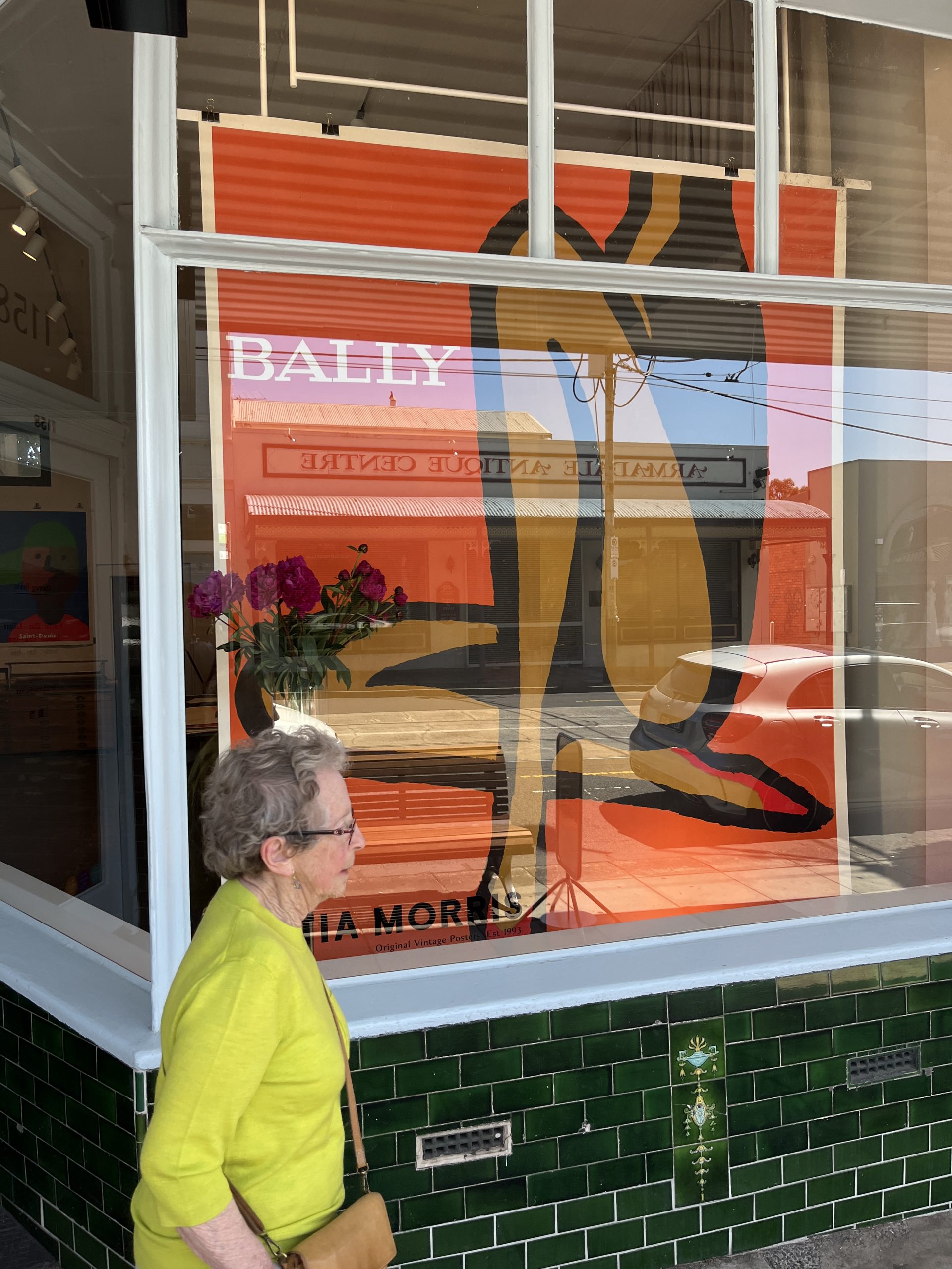
The Giant Bally Orange
The spectacular Bally Orange in billboard size 210x320 cm. Designed in 1967 by Bernard Villemot the pioneer of french posters. We are thrilled to feature this incredible poster in the gallery's window. In this blog post we will review Bernard Villemot's poster path.

Who is Bernard Villemot ?
Bernard Villemot (1911–1989) was a prominent French graphic artist known for his iconic and innovative poster designs. His work, characterized by bold colors, simplicity, and a keen focus on visual impact, has left a lasting legacy in the world of advertising. While Villemot created posters for various brands, some of his most famous works include:
- Orangina (1953): Perhaps one of Villemot's most recognized and celebrated posters, the Orangina advertisement features a minimalist design of an orange pierced by a straw. This image became synonymous with the brand and is a classic example of Villemot's ability to distill a message to its most essential elements.
- Bally (1982): Villemot designed several posters for the luxury Swiss shoe and fashion brand Bally. While the specific details of each Bally poster may vary, Villemot's signature style likely involved vibrant colors, clean lines, and a focus on showcasing the elegance and sophistication of Bally's products.
- Perrier (1951): Villemot created several posters for the mineral water brand Perrier. One of his notable Perrier posters features a stylized woman in a red swimsuit holding a bottle of Perrier, emphasizing the refreshing nature of the beverage.
- Air France (1963): Villemot designed a series of posters for Air France, emphasizing the glamour and excitement of air travel. One of his notable Air France posters features a stylishly dressed woman in a red hat against a blue sky, capturing the allure of jet-setting.
- Bic (1963): Villemot created memorable posters for Bic, the stationery and lighter company. His Bic posters often featured simple yet impactful images, such as the well-known Bic pen and lighter advertisements.
- SNCF (French National Railway, 1975): Villemot's SNCF posters showcased the efficiency and convenience of train travel. One notable poster features a train emerging from a tunnel, symbolizing the speed and connectivity of the railway system.
Villemot's approach to poster design involved distilling complex messages into visually striking and memorable images. His work has been praised for its timeless quality and its ability to communicate a brand's essence with clarity. Villemot's posters are not only celebrated for their advertising effectiveness but also for their artistic merit, contributing to his status as one of the most influential graphic artists of the 20th century.
