Celebrating Melbourne Design Week with Vintage Posters
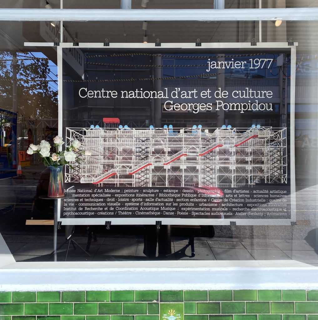
‘Georges Pompidou’ Jean Widmer
“Widmer claimed a practice of basic design, grounded in reduction, coherence, and legibility. Every form, every colour, every proportion carried meaning.”
– Centre Pompidou
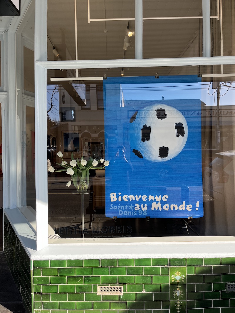
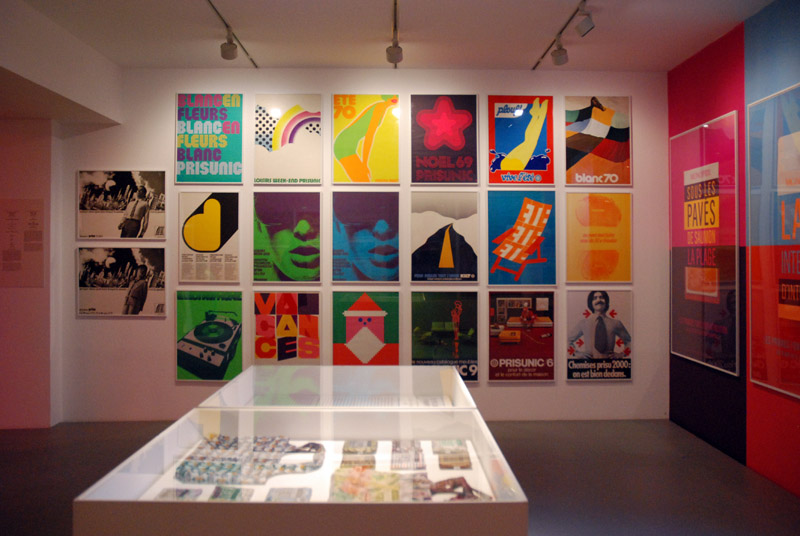
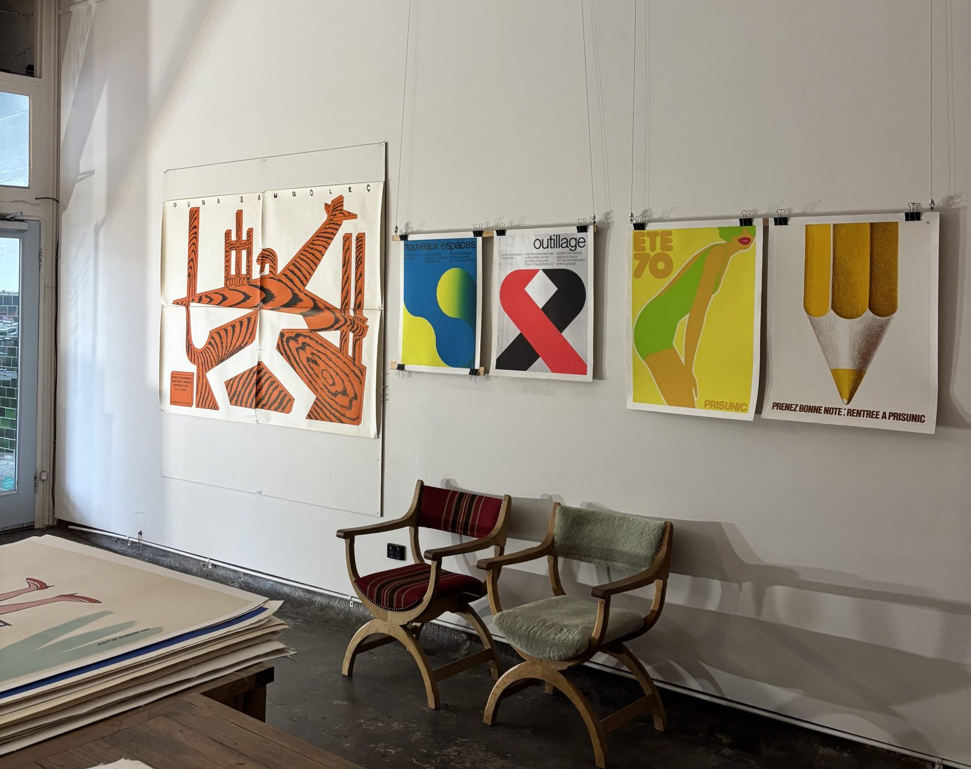
To mark Melbourne Design Week, Letitia Morris Gallery pulled together a selection of graphic design posters that show off the minimalism, colour and typography of the 1960s and 1970s. The spotlight fell on two European designers, Jean Widmer and Friedemann Hauss, whose work grew out of the Swiss design tradition and its belief that good design should be clear, useful and quietly beautiful. Their posters are a reminder of how much power sits in a simple grid, a strong symbol and a well chosen colour.
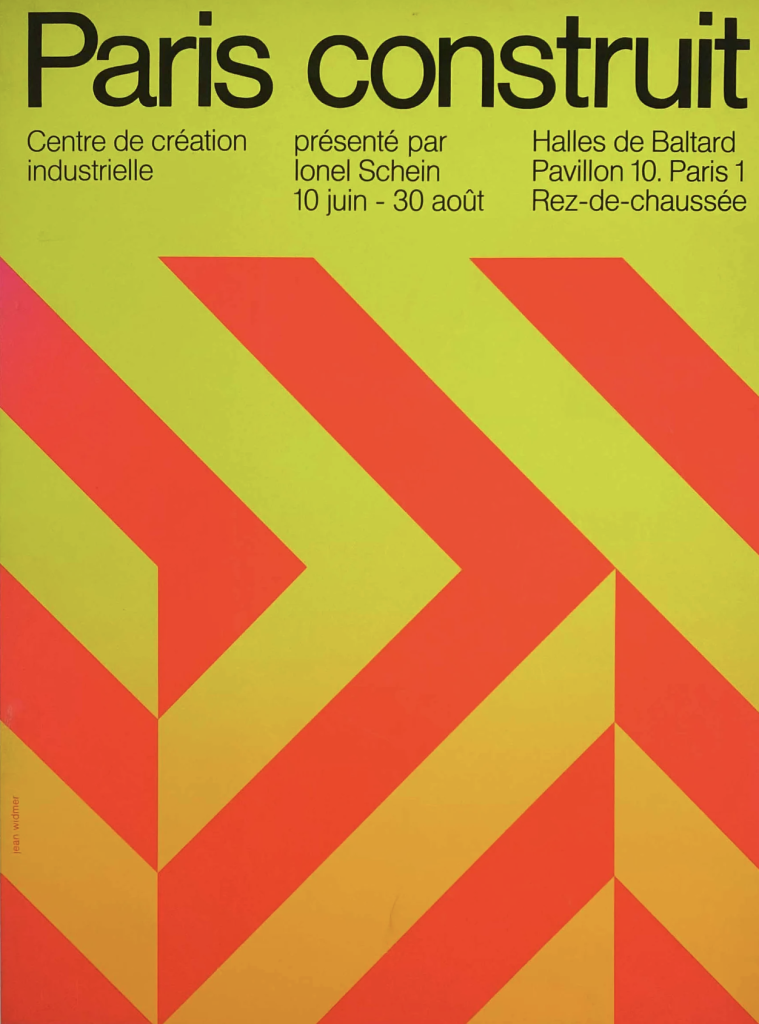
‘Paris Construit’ – Jean Widmer
What Is Melbourne Design Week
Melbourne Design Week is one of the largest design events in the Asia Pacific region, a stretch of exhibitions, talks and installations that celebrate design in all its forms. It is the kind of occasion that invites you to look again at the objects and images we usually take for granted. For a gallery that deals in vintage posters, it was a natural moment to show how the design thinking of half a century ago still shapes the way we see things today.
Rather than chase the newest work, the gallery looked back to the 1960s and 1970s, a period when a particular way of designing reached its peak. The posters chosen share a family resemblance. They are clean, confident and economical, and they prove that restraint can be every bit as striking as excess.
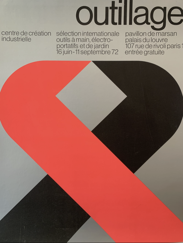
Jean Widmer and the Art of Reduction
The gallery gave pride of place to Jean Widmer, a designer born in 1929 who built his career in Paris. His philosophy can be summed up in three words that guided almost everything he made: reduction, coherence and legibility. Every element in a Widmer design had to earn its place. Nothing was there for decoration alone.
Widmer drew heavily on Swiss typography and minimalist principles, always putting function ahead of ornament. He favoured clean grids, bold symbols and strong, unified visual identities, and he became especially associated with cultural institutions and public projects. Two of his works featured in the gallery’s selection, “Georges Pompidou” and “Paris Construit,” both showing his gift for saying a great deal with very little.
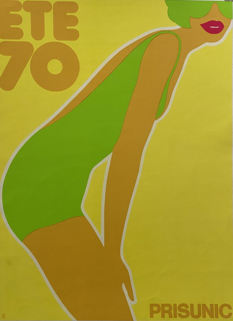
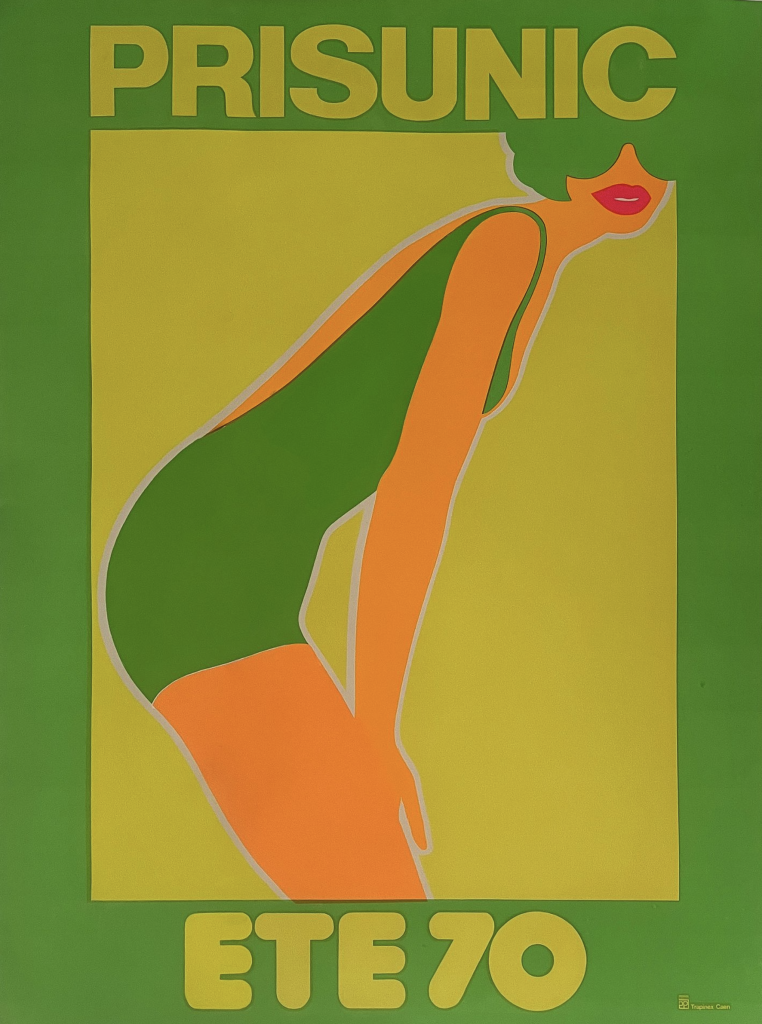
‘PRISUNIC ETE 70’ by Friedemann Hauss 1970
The International Typographic Style
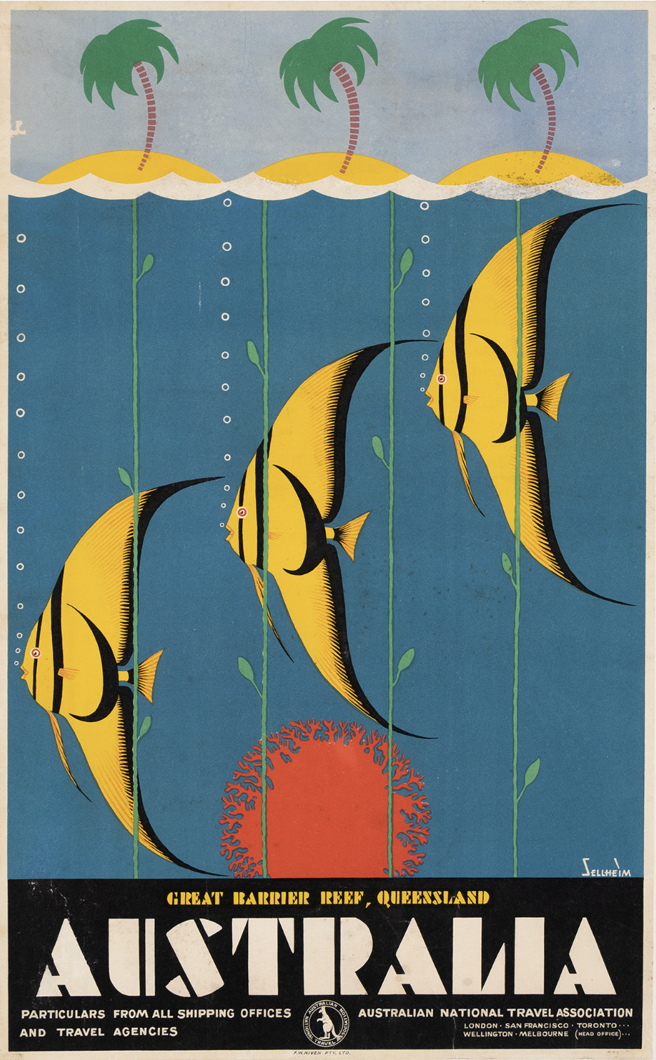
Widmer’s approach did not appear from nowhere. It grew out of a movement that took shape after the Second World War, when Swiss and German designers pioneered what became known as the International Typographic Style. Their aim was communication that felt neutral and objective, free of the persuasive flourishes that had come before. It is the same design language that shaped the mid century Qantas travel posters by Harry Rogers, which shows how far these ideas travelled.
To get there, they relied on a handful of tools that still underpin graphic design today. Modular grids brought structure. Asymmetrical layouts brought movement and interest. Sans serif typefaces brought a plain, honest clarity. The combination produced work that was harmonious and easy to read, and it spread far beyond Switzerland to become a genuinely international language of design. When you look at a Widmer poster, you are looking at that language spoken fluently.
Friedemann Hauss and Prisunic
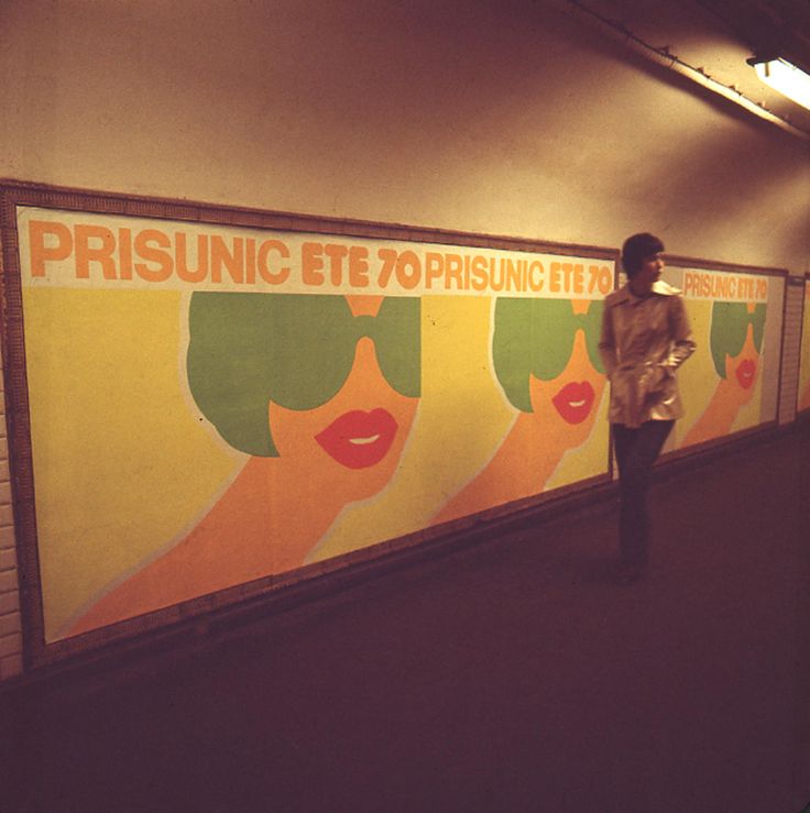
The second designer in the spotlight was Friedemann Hauss, a German who moved to Paris in 1967 after studying graphic art in Basel, one of the great centres of Swiss design education. His featured work was “PRISUNIC ETE 70,” created in 1970 for the French retailer Prisunic.
This was a summer fashion advertisement, and it did its job out in the open. It appeared across Parisian streets and in the subway, where thousands of people would have passed it every day. The design was admired enough to win the prize for outstanding poster design in 1970, a fitting reward for work that had to be both commercially effective and genuinely good looking. It is a lovely example of how the discipline of Swiss design could be turned to something playful and popular.
Why These Posters Still Speak
What ties this selection together is a shared belief that good design does not need to shout. A clear grid, a single strong image and a considered use of colour can carry a message further than any amount of clutter. That lesson has not aged. If anything, it feels more relevant now, in a world crowded with visual noise, than it did when these posters were first pasted up.
There is also something satisfying about seeing this work in its original printed form rather than as an image on a screen. These posters were made to be experienced at full size, with real ink on real paper, and a lot of their character lives in that physical presence. The scale, the crispness of the type and the flatness of the colour all read differently in person, and they carry a quiet authority that reproductions tend to flatten out.
Celebrating them during Melbourne Design Week was a way of connecting the past and the present, and of reminding us that the best design tends to last. For anyone who loves this era, the pieces are available to view and to purchase through Letitia Morris Gallery.